Polly Ngale | Arnwetky Exhibition

On display in the charcoal gallery. Can't visit the gallery? View our online exhibition here.

 
click on image above to view the exhibition catalogue

Polly Ngale is one of the most senior custodians of her country Ahalpere, in the heart of Utopia, located in the north west corner of the Simpson desert and roughly 350km north east of Alice Springs, along the Sandover Highway.

Polly in considered one of the most accomplished painters from the Utopia region and is inspired by the Arnwetky (conkerberry) – a green tangled, spiny shrub that produces fragrant white flowers. After the summer rains tiny green berries begin to grow and ripen, changing colour over the weeks from light green to pinks and browns to yellow, to shades of red and purple when they finally ripen. The fruits very much resemble a plum and is often referred to in English by Polly as a ‘bush plum’. The Arnwetky is a popular variety of bush tucker for the people of Utopia, as well as possessing medicinal properties.

During the Dreamtime, winds came from all directions, carrying the Arnwetky seed all over Polly’s ancestors’ Anmatyerre land. To ensure the continued fruiting of the Arnwetky, the Anmatyerre people pay homage to the spirit of the bush plum by recreating it in their ceremonies through song and dance, and in recent years, through painting. The patterns in the paintings can represent the fruit of the plant, its leaves and flowers, and also the body paint designs that are associated with it during ceremony.

For Anmatyerre women, the bush plum is a source of physical and spiritual sustenance - reminding them of the sacredness of Ahalpere country. Its story is crucial to Anmatyerre women's ceremonies.

Polly’s depictions of Arnwetky are the accumulation of a lifetime's knowledge about the country that she loves and feels a personal responsibility to care for. The power of the art resonates across geographical, botanical and spiritual dimensions.

In recent years, Polly has undergone a renaissance in her work - by all accounts producing some of the finest paintings of her career to date.

Kate Owen Gallery is delighted to present Polly Ngale’s new body of work, which showcases her exuberant and masterful depiction of Arnwetky .

Read More:

Polly Ngale's Bush Plum


Defining Tradition | black & white

We are delighted to present our third exhibition in the 'defining tradition' exhibition series. In this show, we are celebrating the trailblazing artists who moved away from colour and pursued a more minimalistic style. Inspired by ancient Dreamings and the Australian landscape, their works are restrained in colour palette, yet remarkably powerful with exceptional compositional designs.


Article

On display are the great trailblazers such as Dorothy Napangardi and Lily Kely Napangardi. Dorothy’s early years at Mina Mina (where she lived a traditional bush life), along with the sacred Dreaming stories that inhabit the land, are the inspiration and subject of her work. 

Dorothy’s early artistic endeavours consisted on subject matter such as Bush Plum and Bush Banana – wild fruits that grow in abundance around Mina Mina – depicted in vibrant acrylic tones. Even at this stage, her superb sense of composition was evident. When Dorothy had the opportunity to return to Mina Mina in the mid 2000s*, she had the opportunity to be inspired by the landscape, and  her work developed towards a previously unseen abstracted method of Aboriginal art – all iconography pared back to the barest essentials. Just as Dorothy’s visual effects are subtle and intriguing, so too are their connection to culture and country.

The Australian art world instantly took note of this trailblazer. In 2002 her major solo exhibition (and the first solo exhibition for an Indigenous Australian artist) opened to considerable acclaim at Sydney's Museum of Contemporary Art, and later toured Asia. In 2012 she became the first indigenous Australian artist to have work accepted by Art Cologne, and in the same year her work was displayed in Ancestral Modern, an exhibition at the Seattle Art Museum. Since Dorothy’s passing, the New York MET has acquired one of her pieces, and there has been a retrospective exhibition at the Seatle Art Museum.

Also on display are the gestural artists such as Charmaine Pwerle. Daughter of Barbara Weir and granddaughter of Minnie Pwerle, Charmaine hails from one of Aboriginal art’s great painting dynasties. Whilst it is tempting to look at Charmaine's artworks in light of her famous relatives, her art demands attention in its own right.

It makes its own statements.

Charmaine’s subject matter draws on stories passed down for generations, but approaches it in a wholly different fashion than her grandmother to whom she is so often compared.

Defining Tradition | black + white also showcases artists who employ exceptionally fine dot work and complex designs, such as Anna Price Petyarre and Dulcie Long Pula.

Like their forebears from Utopia, Anna and Dulcie continue to astound the art world with their distinct and rich artworks, in recent years both having branched out and pursued a more minimalistic style. Exhibiting a restrained colour palette, their works demonstrate an exceptionally fine attention to detail, highlighted by complex designs and fascinating insights into the deep underlying cultural meaning associated with their artworks.

We also present pieces in this exhibition by Clifford Possum and Helen McCarthy Tyalmuty, who have used a black and white colour palette to present stories that are of a more ominous, sombre tone. Follow the links below to find out more about these artwork stories:


Click here to read the story of Awurrapun


Click here to read the story of The Tjangala Brothers


Click here to read our recent blog piece: Understanding Colour 

We look forward to seeing you in the gallery soon to see this incredible display of works!

* Mina Mina is now uninhabited desert country west of Nyirripi,  since the Warlpiri people’s move into communities Nyirripi and Yeundumu.


 Black & White Art at Home

Love the artworks on display in this exhibition, but are uncertain as to how to incorporate them in to your home or office space? Here is some advice from one of our Senior Art Consultants, Surrey:

The use of black and white Indigenous paintings for contemporary interior spaces create an unquestionably sophisticated and elegant look.  The monochrome allows the viewer to focus on the power of the composition, the ancient narratives behind the designs.

Used in modern interiors these striking artworks are often combined with sleek metals and rich timber surfaces and help create enviable calm, contemporary spaces that feel uncluttered and easy to live in.

Interested in arranging a home trial, digital hang, or using one of our other gallery services? Contact Us and one of our friendly Art Consultants will be able to assist you.


Gallery News - April 2019

What an incredible start to the year it has been for the KOG Crew. Here's a summary of 2019 so far;

exhibitions and artist in residence programs

So far we've held two exhibitions in our 'defining tradition' series, with more planned later in the year and extending in to the 2020 exhibition schedule. This weekend will be the official launch of our exhibition seven sisters where artists Andrea Adamson, Athena Nangala Granites and Gabriella Possum Nungurrayi depict the epic Aboriginal Dreamtime story of an Ancestral Being in the guise of a man - who relentlessly pursues seven sisters (Ancestral Women) over land and sky. It is a tale of lust, love, passion and danger. We are hanging the exhibition this week and it is a cracking selection of works - this exhibition is a must-see! Follow the links below to find out more about our past and current exhibitions.

We know our artist in residence program is hugely popular and we are planning to have another one this year, but please be advised that many of the artists we represent have great family and cultural responsibilities meaning plans can change at a moments notice. To stay up to date with the latest news on our artist in residence programs, sign up to our mailing list.

What other exhibitions do we have in store for 2019? Well, we like to keep it a surprise! But if you're a fan of Barbara Weir, Karen Napaltjarri Barnes, Helen McCarthy or just love black and white artworks - watch this space! We'll have some exciting news for you shortly.

artist awards & recognition

A big CONGRATULATIONS to Lockhart River artist Fiona Omeenyo who is a finalist in this years Montalto Sculpture Prize! Fiona's work has been widely exhibited in Australian galleries since winning her first art award in 2001. She has had 15 solo exhibitions and over 40 group exhibitions, as well as being represented in many private and public collections including the National Gallery of Victoria and QUT Art Museum. View Fiona's latest body of work here

We also send our CONGRATULATIONS to Helen McCarthy Tyalmuty - selected as a finalist in the 2019 Calleen Art Award! The acquisitive painting prize is held at the Cowra Regional Art Gallery each year. The winner is announced on Saturday 4 May.

Helen McCarthy Tyalmuty 'Marrawuk (Start of the Wet)' - HMCG0112A  119 x 200cm

Already winner of the Peoples Choice Award at the 2007 Telstra National Aboriginal & Torres Strait Islander Art Award, in 2017 Helen appeared as a finalist in prestigious art prizes such as the Paddington Art Prize, the Georges River Art Prize, and was awarded the Inaugural Margaret Olley Art Award at the Mosman Art Prize. Over the last eighteen months Helen has spent time in Alice Springs, Darwin, Daly River and Sydney, with 2019 promising to be another exciting year of creative output.

Click here to view our extraordinary collection of works from Helen McCarthy Tyalmuty including brand new artworks.

gallery awards & recognition

The KOG Crew are still buzzing after being named Champion Specialised Retail Small Business for 2019 at The Australian Small Business Champion Gala Dinner and Awards Ceremony held on Saturday 6 April with over 1,100 guests in attendance. Daniel, Surrey and Liz were in attendance and received an award statuette, certificate and gained national recognition as an industry leader. Here at Kate Owen Gallery, we couldn’t do what we do without the incredible artists who choose to bless us with their art and our wonderful clients, so a big heartfelt THANK YOU!

We've also just received the news that our loyal clients have voted for us in the 2019 Inner West Local Business Awards and we have been named as a FINALIST! Our sincere thanks for your loyalty and support over the years. 2019 is certainly turning out to be an exciting year for Kate Owen Gallery!


Understanding Colour

The artists represented at Kate Owen Gallery have a magnificent sense of colour. They instinctively use original and vital colour in a balanced and harmonious way on the canvas. Most of us, however, are not so lucky. Sometimes we feel that we have a colour scheme for the home or office, but often, however hard we try, it just doesn’t come off or doesn’t feel ‘complete’. We can also get stuck in a rut and not know how to stop repeating much the same colour scheme every time.

Being able to understand the terms and processes with colour will help you knowledgeably communicate your vision. So in this article, we’re going to give you a crash course on colour! Hopefully it will help you use colour more adventurously and with confidence. You may well disagree with some of my ideas and conclusions. Please blame this on the fact that colour appreciation is personal and subjective; so much a matter of personal taste and feeling, and I can only state what I myself feel to be true. 

The whole of this blog article is concerned with colour, but there can be art without it. The lack of colour does not make a master drawing less a work of art. Picasso’s ‘Guernica’, possibly the most profound painting of the last century, is in black and white. View our range of black and white artworks here.

The Basics:

Colour is perception. Our eyes see something, and data sent from our eyes to our brains tells us its a certain colour. Objects reflect light in different combinations and translate them into the phenomenon we call colour.

Colour theory is both the science and art of colour. It explains how humans perceive colour; how colours mix, match or claw; the subliminal (and often cultural) messages colours communicate; and the methods used to replicate colour. 

Physically, unless we are colour blind, we all see the same things in the same way and in the identical colours. The human eye may be similar to a photographic camera, but our brains are not dark-rooms. What we make up there of visual impressions is personal and has only subjective meaning.

The Colour Wheel:

The colour wheel consists of three primary colours (red, yellow, blue), three secondary colours (colours created when primary colours are mixed: green, orange, purple) and six tertiary colours (colours made from primary and secondary colours, such as blue-green or red-violet)


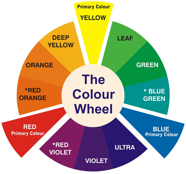
Draw a line through the centre of the wheel, and you’ll separate the warm colours (reds, oranges, yellows) from the cool colours (blues, green, purples).

Warm Colours are generally associated with energy, brightness and action, whereas cool colours are often identified with calm, peace and serenity.

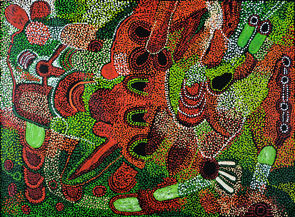
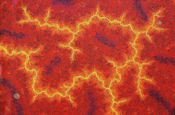
When you recognise that colour has a temperature, you can understand how choosing all warm or cool colours in your home or office can impact the mood or ‘feel’ of the space. Take for example these two artworks by Ronnie Tjampitjinpa:


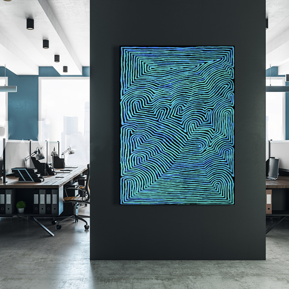
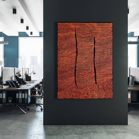
While the artwork to the left beautifully compliments the feature wall in the background, I would say the overall ‘feel’ of the space is cooler, as opposed to the piece on the right which adds warmth to the space.

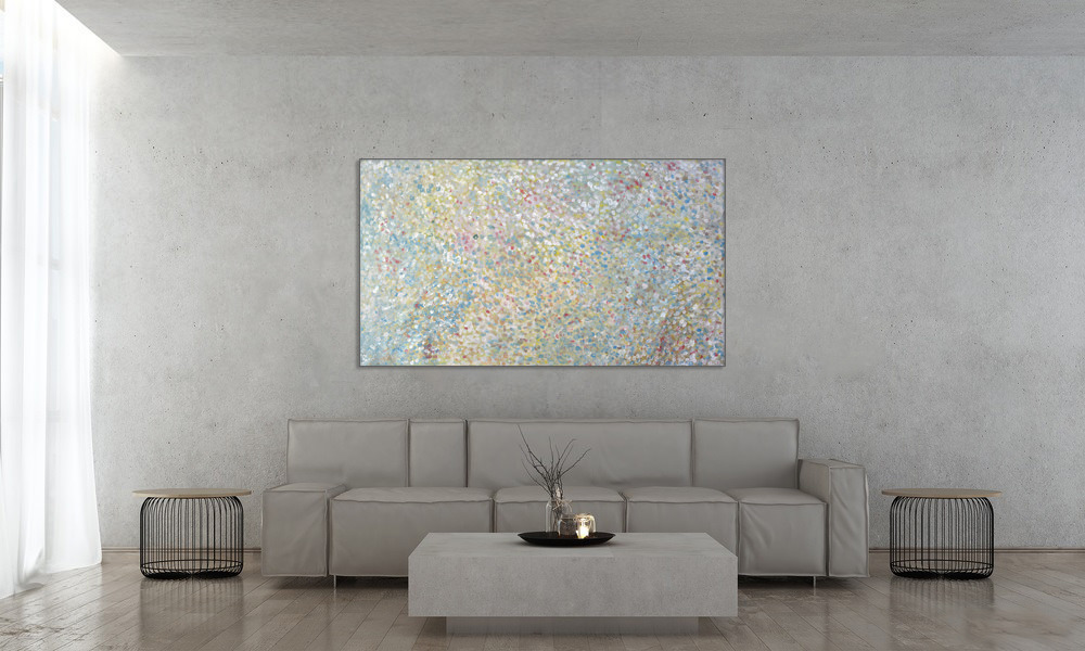
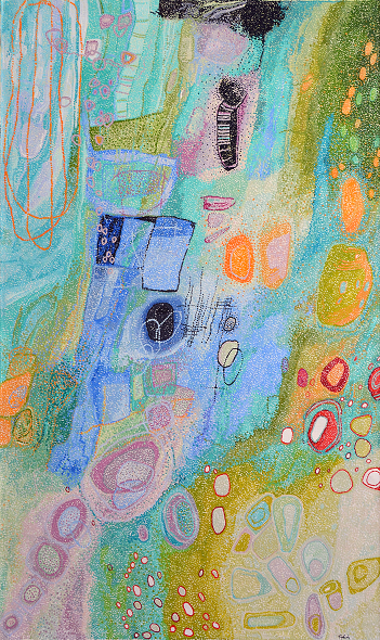
Simply put, tints, tones and shadows are variations of colours on the colour wheel (used by adding white, black or grey to the colour). Colours mixed with white change tone and intensity. As the digital hang below of Freddy Purla’s artwork ‘Grandmothers Country’ reveals, a lack of brilliant colour does not mean a lack of varied colour.


Just because you have a neutral décor, doesn’t mean you can’t add a splash of [subtle] colour!

Using the colour wheel, designers develop colour schemes. Some of the most common terms you may have heard are:

Complimentary Colours - complementary colours are opposites on the colour wheel. Here’s an example of an artwork by Patricia Baker where she has used the complimentary colours red and green:

Because there’s a sharp contrast between the two colours, this piece really pops!

Analogus Colours - analogue colour sit next to each other on the colour wheel - red, orange and yellow for example. When creating an analogous colour scheme: one colour will dominate, one will support and another will accent.

Triadic Colours - triadic colours are evenly spaced around the colour wheel and tend to be bright and dynamic. There is a lovely visual contrast whilst simultaneously being harmonious.


Helen McCarthy Tyalmuty using tridadic colours of orange, green and purple.

 Messages Colours Communicate:

Most of us have a favourite colour or prefer some colours over others. This is because it can affect our moods so we surround ourselves in the colours that have a positive impact on our mood.

Wassily Kandinsky, a renowned Russian painter and art theorist, was one of the first pioneers of colour theory and believed the following colours communicate the following qualities:

  • Yellow – warm, exciting, happy
  • Blue – deep, peaceful, supernatural
  • Green – peace, stillness, nature
  • White – harmony, silence, cleanliness
  • Black – grief, dark, unknown
  • Red – glowing, confidence, alive
  • Orange – radiant, healthy, serious

What do you think? Don’t forget, colour also has cultural significance, political associations, and religious links.

 Colour inspired by surroundings:

We live in a colourful world, a world that acts as the perfect inspirational trigger for design. The rugged beauty of the Australian landscape can be re-created in even the most urban surroundings. Draw inspiration from the unique shades of native elements, such as the flame-orange hues of the desert, olive greens of the eucalyptus trees, or dusty pinks that pop up at the sky at twilight. Combine these punchy shades with complimentary earth tones to bring warmth and richness to even the simplest interiors.

Blues and greens are an intrinsic part of Australia’s diverse bush environment, so why not replicate this palette in an urban residence? Here, the soothing olive greens of melaleucas, and grey-blue of gum trees bring a little of the bush into the city. 

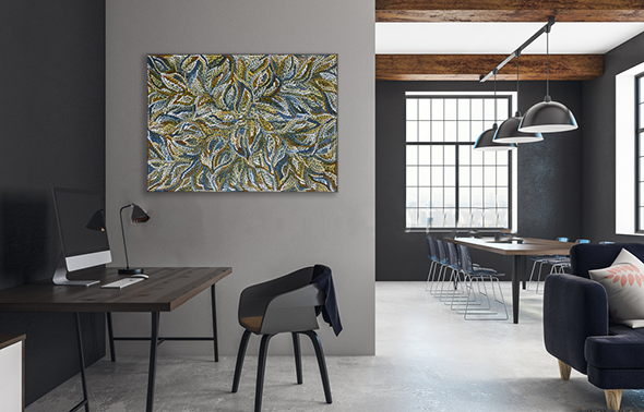
 Dulcie Long Pula’s Bush Yam Leaves sits beautifully in this loft apartment.

Composition Considerations:

It is impossible to speak about colour and completely ignore composition, drawing and design. For instance, Rembrandt and Braque used similar colours - Rembrandt to give a sense of light and depth, Braque for flat, decorative effects. Black in a Rembrandt is used in shadow and mysterious distance, quite different from the heavy black outlines and flat areas in a highly stylised Braque still life.

One example from the KOG stockroom are these two brilliant artworks by the highly talented and versatile artist, Helen McCarthy Tyalmuty.


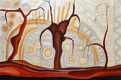
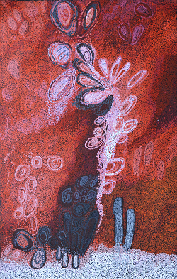
She has used the same two predominant colours in both artworks (red and white), but her composition and painting technique have completely transformed how I perceive the colours. In ‘Marrawuk (The Dry Season) - HMCG0086’ I perceive the red colour as trees in the foreground, whereas in ‘Ngete (Ant Hills) - HMCG0104A’  I see the white accents in the foreground with the red colour receding as if it were the background. Personally, I also think the artworks have very different moods - Marrawuk really does capture that feeling of a still, hot afternoon, whereas in Ngete I feel energised - like the energy of a hundred worker ants are about to burst off the canvas!

Feeling Inspired ? Or even more confused? Either way, not to worry – here at Kate Owen Gallery we have a wonderful team of friendly, informative art consultants who can help you find the perfect artwork to finish off that home or office project. Get in touch with us today – we love hearing from you! We also have a great range of gallery services which you can explore here.