It is with great excitement that we are hosting the first Sydney solo exhibition for Niah Juella McLeod, an exciting new voice in the contemporary Indigenous art scene, winner of the 2017 Paddington Art Prize Young Artist Award and finalist in this year’s Paddington Art Prize. Niah is a descendant from the Monero, Wandandian and Yuin people from south eastern Australia and her works tell of stories passed down from her parents which are unique to her history.
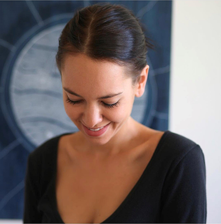 As the daughter of artist Kathrin Sharp and Aboriginal activist, poet, healer, musician and Yuin Elder Bobby McLeod, Niah's works tell of stories passed down and unique to her history.
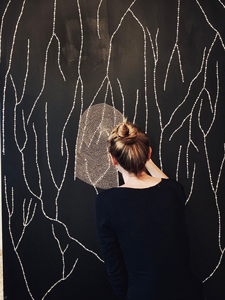
A fine dot artist, Niah began painting as a form of meditation, only first exhibiting her work in public in 2015! We instantly noticed Niah's incredible talent at the 2017 Paddington Art Prize, where Niah stunned visitors and the judges alike with her incredible depiction of “Ngudjung Yugarang” – Mother’s Heartbeat.
Niah's art continues to develop and we are delighted to present her latest body of work - the meditative process is evident in her works and explores her spiritual and physical connection with place and people. Enjoy!
Interview with Niah Juella McLeod
Do you remember the first time you picked up the brush and started painting?
Yes, I was actually living overseas at the time.. a friend of mine had an art studio so I would to spend a lot of my days in there hanging out with her and one day picked up the brush and starting doodling on her “offcuts”. It wasn’t until I moved home though that I painted my first painting, I would say I have definitely become more intricate with my paintings… I do worry less though about the tiny little imperfections, I’ve come to really love those and I feel like it makes a painting more unique.
What inspired you to become an artist?
I’ve always drawn and painted, Mum always encouraged both my brother & I to be creative. We were always surrounded by beautiful artworks my grandmother brought back from different remote Aboriginal communities where she worked as a nurse and midwife.
Drawing and painting was always something to me more like meditation, a way to switch off or tune out; not realising until later it was doing the opposite. I only really painted here and there and doodled in books like my art diary, then decided to move Sydney just over a year ago. I was signed with a modelling agency and working full time.
Within the first week of living in Sydney I took myself off to the South Coast, I needed to see my Grandmother whom I hadn’t seen since I was a baby. I met up with my Uncles, Aunties, Brothers, Sisters. Re-connecting with my family has been one of the most significant moments in my life.
I looked at myself, my life a little differently, my scribbles, my drawings were more meaningful. My first painting I’d really connected with was one I had done specifically for my Nanna Mac.
After that trip, I caught the train back to North Bondi, quit my job and quit the modeling world. I entered myself into an exhibition art fair, painted my ass off for three months and sold every single piece. Whoo!
I have recognition most importantly from Family and now I can pay my rent through doing something that is so intrinsically part of who I am and so worth doing! I have started painting full time. It is still such an extreme journey, I'm so proud of myself and of my faith in my belonging.
Can you tell us about your artworks?
I don’t have a plan when I start panting unless it's a commission, Usually I just dive in and they turn themselves into something. They are a way for me to connect, it's my belonging and my journey .. I was once asked if I could describe my paintings to the visually impaired what would I say .. I think that it looks like movement but feels still.. that still resonates with me.
Can you tell us about your favourite dreaming that you paint?
I have a Painting named ‘Ngudjung Yugarang - Mother’s Heartbeat’. This is a special piece very close to my heart. I remember I had my set paintings for my first exhibition with 4 weeks to go and I had decided to paint a 1.5 X 2 metre painting which was the first ‘Mothers Heartbeat'. I stayed up almost every night for 4 weeks and painted like crazy and I’m so happy that I did. I created her and I fell in love with her and so have a lot of other people. She has a really beautiful feeling when you get to see her in person. Once I had finished I had found the title in one of my father's books, the name just felt perfect.
As soon as I finished painting I also fell pregnant with my first daughter - meant to be.
When you are painting, what are you thinking of?
It can go either way.. Literally everything goes through my head… it's like I completely go through every situation I’m currently in. Or nothing at all - I can blink and it's been 3 hours (if I’m lucky) and I’ve finished half a painting.. my kids are usually running around me or at my feet wanting something every 3 minutes but if I get the time to myself I will usually blast reallllly bad (awesome) music and try to completely switch off.
How do you paint? Do you have an easel; do you have canvas on the floor or wall?
I paint on canvas either on the floor or just on any table the canvas fits on away from little grubby kiddy fingers that are constantly waiting to pounce or “help".
“When I’m not painting, you can find me…”
I have a 3 year old daughter and a 1 year old son so I’m trying to do my best with keeping up with them all day every day, then at night when they sleep I can paint if my partner can’t wrangle them for a few hours .. soo , beaches, parks, dance classes, soccer classes, farms and can probably recite every lyric of Frozen and Moana.
“If I wasn’t an artist, I would be a…”
Honestly, probably an even more hands on mum with a cleaner house, that's a full time job in itself.
What’s your advice to others hoping to become an artist?
If I could pass anything on, it would be to go for every opportunity, even if you think you aren’t “qualified” or good enough. I think travelling and meeting new people, putting yourself out there is very important and has been a big help for me, I’m an introvert and love my anonymity. Though I surround myself with people that are so driven and passionate about what they do, it’s a constant inspiration to keep doing what I’m doing.
Don’t be so hard on yourself, you are your own worst critic and to just surrender to it.
Video: Niah Juella exhibition